Accessibility Tests Extended Descriptions: Description of Bar Chart

Accessibility Tests Extended Descriptions
Description of Bar Chart
    • Notifications
    • Privacy
  • Project HomeLong Description Test
  • Projects
  • Learn more about Manifold

Notes

Show the following:

  • Annotations
  • Resources
Search within:

Adjust appearance:

  • font
    Font style
  • color scheme
  • Margins
table of contents
  1. Cover Page
  2. Introduction to Extended Descriptions
  3. Extended description using HTML details and summary
    1. Detection and utilization of details and summary elements
  4. Extended description placed on a separate HTML file and connected with the image by using hyperlinks
    1. Linking to a single extended description placed in a separate HTML file via text hyperlink

Description of Bar Chart

Overview

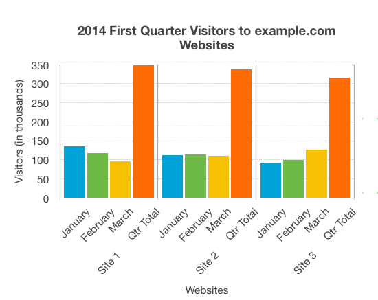
The chart shows the website hits for the first quarter of 2014. It shows that Site 1 has more visitors than either of the other sites, but the number of visitors is decreasing. Site 2 has a fairly constant number of visitors, while for Site 3 page hits are increasing month on month.

Data

PeriodSite 1Site 2Site 3
Jan13511292
Feb11711499
Mar96111126
Qtr Total348337308

Presentation

The bar chart represents both the number of visitors per month for each website, and the total number of visitors per website for the entire quarter. Website visitors for each month are represented using columns lined up horizontally, with heights indicating the number of visitors. A fourth column is provided for each website with the accumulated site visitors for the quarter.

Navigate back to bar chart image.

Annotate

Previous
This work is licensed under a Creative Commons Attribution-Noncommercial-Share Alike (CC BY-NC-SA) license.
Powered by Manifold Scholarship. Learn more at
Opens in new tab or windowmanifoldapp.org